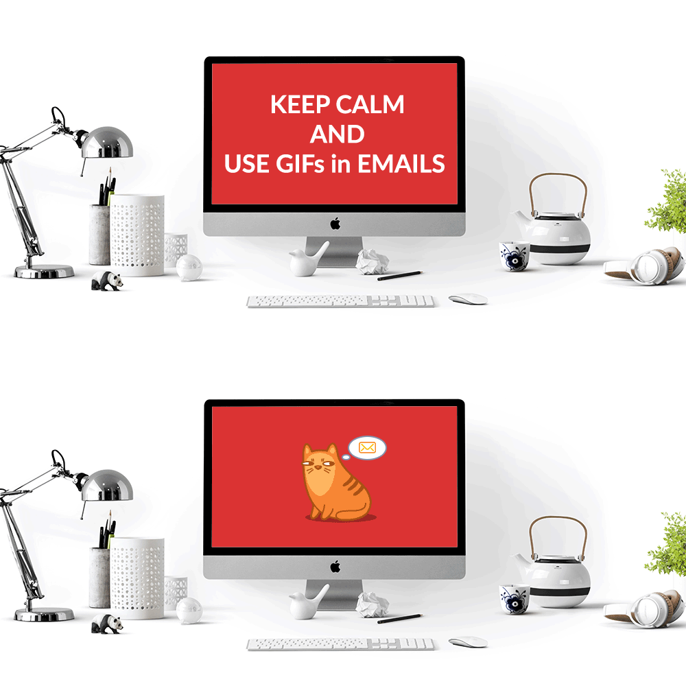
Every day countless emails arrive at our inboxes. Lucky ones that grab our attention via attractive subjects go for the second round. The competition is tight – which ones will look better and create a trustable brand image that will stop us clicking the delete button? It will take a few seconds to make our decision. Welcome to the battlefield that all brands need to face: Creating “beautiful” yet beneficial emails that users want to engage.
Sure fact is one of the pillars of email marketing success is the design. This crucial aspect directly affects the deliverability and has an impact on subscriber engagement. Our experiences show that following and implementing the latest trends and trying alternative designs to test different user experiences are critical for increasing email marketing efficiency.
Just a little reminder: Email subject is the point of entry, so be sure to make it as proper as they can be. Now off to design tips and tricks.
First things first, we all should keep in mind that email design is another proficiency that requires knowledge and experience. One mistake many brands make is underestimating the details and pushing designs that may work for other digital marketing channels but not the email. This situation also negatively effects another essential part of email marketing: HTML coding. Design and coding should work in balance to keep deliverability and engagement high.
Tips That Will Save Your Life When Designing and Coding Emails
Be sure to check these points to increase your design and code efficiency:
- We recommend designs with 650-750 pixels wide, and the total image size should be under 1 MB.
- Since many inboxes avoid showing pictures, you should include a proper text space where you will deliver your message. For readability, email body font size should be 12 to 16 whereas disclaimer font size should 11 at the minimum.
- You should design text parts in your emails as text coded as possible.
- Spaces to be text coded should have one color background, and you should avoid the degrade effect.
- Spaces to be text coded should include system fonts.
- Most of your subscribers spend a couple of seconds for any mail. For this reason, the first three lines are critical. You should include headlines and subheaders to give an instant idea about the content.
- It is better to use left alignment. You should emphasize the overall message and add CTA (Call to Actions) buttons to increase interaction.
To increase email channel efficiency, you may also check these points:
- You may change the CTA colors, texts, and places in emails to observe the changes in interaction and engagement.
- In addition, you may vary the format of the mail (long form, one column, three columns, etc.) to reach the most optimized design.
- You may try different types of images. GIFs, infographic bits, or scenes from videos may attract users and increase interactions.
- Based on feedback from your users and trends, you may change the design template of your emails periodically.
Attention! GIFs are Fun but Tricky for Emails
We all love GIFs in emails, right. Though they add color and action to emails, marketers should be careful when using them.
A GIF is an animated image file format created via combining several other images or frames into a single file. As mentioned earlier, for deliverability reasons image sizes in total should not exceed 1 MB in an email. Due to the nature of GIFs, the file sizes can be high. As an example, a 3-4 MB GIF carries the risk of being marked as Spam.
At the coding stage, unlike JPG format, you should not slice GIF images. Otherwise, even a one-millisecond difference is going to break the unity of frames and, your GIF is going to look distorted.
In Outlook 2007, 2010 and 2013 do not support GIF animation, only the first screen appears. It is critical to determine the first screen for these Outlook versions.
You may find the platforms that fully supports GIFs below:

For additional email marketing tips and tricks feel free to check other posts in our blog.


